
Н ачиная с версии Microsoft Office 2010 шрифтом по умолчанию в этом замечательном редакторе является Calibri. Не сказать, что данный шрифт плох – нет, он вполне себе симпатичен, однако, большинство пользователей очень привыкли ко всеми любимому шрифту Times New Roman.
Хорошо, если дело было бы только в привычке, ведь можно привыкнуть и к новому шрифту, но, как оказалось, старый добрый Times New Roman очень хорошо себя зарекомендовал, как официальный шрифт заполнения документов, составления отчетов, создания бланков и прочих офисных бумаг. Во всех университетах, школах, государственных учреждениях вышеупомянутый шрифт является шрифтом по умолчанию.
Однако, развитие текстовых редакторов не стоит на месте. Компания Microsoft уже давно представила пользователям версию Office 2013 года, не за горами выход следующей версии. Поэтому, чтобы раз и навсегда разобраться в этой проблеме, ниже предлагаю простой способ ее решения.
Итак, чтобы установить Times New Roman в качестве шрифта по умолчанию , для начала нужно открыть любой текстовый документ. У меня это будет просто пустой документ. После создания нового документа, необходимо правой кнопкой мыши кликнуть на белом поле и выбрать пункт «Шрифт»: 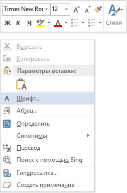
Перед вами откроется окно следующего вида: 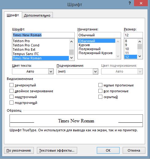
Здесь можно выбрать текущий шрифт, посмотреть его отображение, выбрать стиль, размер и другие параметры. Как видно на скриншоте выше, в данный момент выбран шрифт Times New Roman. Скорее всего, у вас это будет Calibri. Чтобы сделать так, как на скриншоте, необходимо в списке шрифтов найти нужный, а затем нажать на кнопку «По умолчанию». 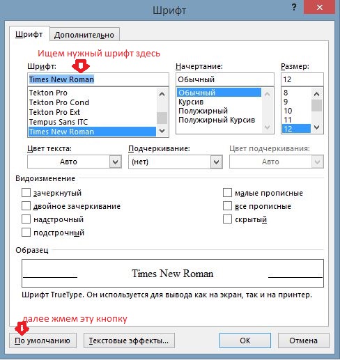
После нажатия, появится такое окошко: 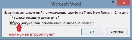
Где вам предлагается установить шрифт по умолчанию только для текущего документа или же для всех документов. Выбираем второй пункт , далее жмем «Ок» до закрытия всех окон.
Вот и все, операция по установке основного шрифта успешно выполнена! В следующий раз, при открытии нового документа, вам не придется вручную менять размер и тип шрифта. Конечно, сделать это не сложно, но в разгар рабочего дня в офисе, даже такая простая мелочь может стать ложкой дегтя в важном проекте.
Данный простой гайд будет также работать и в предыдущих версиях текстовых редакторов.
This typeface is the property of Monotype Typography and its use by you is covered under the terms of a license agreement. You have obtained this typeface software either directly from Monotype or together with software distributed by one of Monotype’s licensees.
This software is a valuable asset of Monotype. Unless you have entered into a specific license agreement granting you additional rights, your use of this software is limited to your workstation for your own publishing use. You may not copy or distribute this software.
If you have any question concerning your rights you should review the license agreement you received with the software or contact Monotype for a copy of the license agreement.
Estimated word count for a 15-page, single-spaced document in 12pt type:
Times Newer Roman is designed to add length to any academic paper that has page requirements and also requires the use of Times New Roman. Just download, install via fontBook or your preferred font management software, and swap to Times Newer Roman. Times Newer Roman is actually an altered version of Nimbus Roman No.9 L (1), a free and open-source font meant to mimic the size and look of the original Times New Roman typeface. The few minor changes that have been made are in pursuit of widening the letters and the spaces between letters without changing their vertical heights at all. This means that a paper of given word count will have more length when rendered in Times Newer Roman instead of the old Times New Roman—hopefully without being noticeable to whoever’s job it is to grade the paper.
The x–height (2) of all lowercase letters has been increased by about 5% so that they sit wider at the same point size. Certain letters that can be widened easily, like the "n", "u", "v", "y", among others, have been edited manually. The size of punctuation has been increased by 15% across the board and the spaces around them increased proportionally.
Brevity is the soul of wit.
Times Newer Roman is a MSCHF project. Text (917) 746-5934 to hear about drops 24 hours early.